31.5.12

charcoal reflections

Reflections. Impression of Lauren in Charcoal.
I don't have the words to go with this sketch yet...

Fuzzy photo. dappled light. double exposure. dreamy eyes. stillness. reflective reflections.

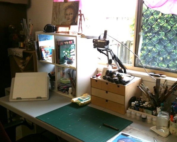
A busy day; yet I have found/ been blessed with 2 hours to do this art.  I could keep fiddling.  But I think at this stage I am doing just that... being charcoal, it is forgiving, but yet I could completely kerstuffer it... that's my technical term term for 'over work it'.  Good enough to warrant framing? I don't know. yet. maybe.

Thursday was: wet. cold. rainy. dentist. shopping.  artsy creative. birthday dinner out.

4 hours later... back from dinner out ( yummo Indian), and re-looking at this portrait  I see one eye is slightly smaller than the other.  I've already re-touched one eye lid.  But what I need to ask myself is - does it matter?  Does it resemble the person? Do you get a feel for who they are? Does it speak to the audience?  I can only hope.  I know I'm starting to like what I do.  And that in itself is something.

I've always believed that realism in art is non-essential.   For me, what the art has to say, and what it evokes in the viewer was far more important. 

My realisation for today: reflecting the beauty within is more important than a photo perfect image


30.5.12

Inspiration board and Art desk organisation ideas


A quick view of another area in my studio. My pinboard - well its really a white board, so I'm using pretty washi tape to 'pin' up ideas, sketches, etc.  Along the front are some 1/2 finished paintings too.  My laptop lives here, and there is a stack of art books waiting to be put away!    I'd really like a proper board I can pin into - maybe covered with cream calico... and nice glass pins...


The art desk... where chaos usually reigns, but this is a rare moment of tidiness so I thought it warranted a quick snap!   I am so lucky to have this space, and  I try and tidy after each project.  

organised: stacked. labelled. sorted. contained. required. useful.

That last one is interesting - what is useful to someone interested in mixed media?  other than everything? I prefer to have things I use all the time right at my fingertips - that way I can save my energy for the actual drawing or painting rather than getting up to find something I want.     For me, out of sight too easily becomes out of mind, and I forget where I put it - or even worse that I even have it.  So I try and keep things really organised where I know where they are, and favourite items are within arms reach at best, or super easy to get to.

The dvd camera is setup ready to record - but at present I'm not doing much in that way as I need a new cable to connect it to the laptop. Plus it takes a long time to edit and upload!  However, I get so much out of watching others create and so appreciate their time  and generosity in sharing, that I will record some more projects - as soon as I get the cable!

simplicity: to have what I regularly use easily accessible. 

28.5.12

Resisting art supply envy

Transparent.  Charcoal. 2012
Charcoal is such a forgiving medium!  I put on some music this afternoon, made the proverbial cup of tea... and went to town having fun.  The thing I love about charcoal is you can add another layer, smudge, re-apply, rub out (well a little bit depending on how hard you pressed).  I particularly was after an ethereal quality, and this worked really well.   It hasn't photographed well - it is so hard to photograph artwork!  In looking at it again I think I might strengthen some of the lines in the background, soften the jawline and generally fiddle!  I'll probably do another of this subject too. 

Simplicity in action: 1 piece of paper and 1 charcoal stick

Why this subject?  My daughter took a self portrait photograph of herself using her camera, and somehow, with a certain aspect of light shining through the window, she captured really amazing light and shapes.  I really like the interesting effects captured in the photo and wanted to replicate the feeling of transparency.

Being transparent:  authentic. open. available. real. honest. vulnerable.

Do you ever feel like you don't have enough art supplies? That you are somehow restricted because you havn't yet lashed out to buy the latest colours in acrylic inks/ paint dabbers/ or distressed inks?  Don't get me wrong - I'm all for art supplies!  But I have so far resisted the urge to buy any of these.  They might very well be the bees knees of art journalling supplies... but somehow I'd rather make do, and use what I already have, and be creative with what I do have.

There is an implicit authenticity in choosing 1 medium or style to focus on. 

My aim: Develop my skills with what I love.    Resist the temptation of art supply envy!


27.5.12

Re-energising your creative self


This is my comfy chair and a little cosy spot I have made, just for me.   It's becoming my 'go to' place.   In a corner of my studio space, it is a place I can sit, read, drink tea, or even snooze if I want to.    I can browse through some art books, think about a design, do a simple sketch,  or even hop online using my laptop.   Although I like to 'escape' for a little quiet alone time, someone in the family usually comes to see what I'm up to eventually - which is sometimes nice, and sometimes annoying :-)  But hey, that's O.K and part of being in a family!

As a creative person, I find more and more, I really need this time of solitude.   I feel more energised, more creative, and plain just happier when I get it.  Even if I do nothing more than a simple pencil gesture sketch, and time for a cuppa, it is a re-charge for both myself as a person, and also my art.
By the way - this is one of my fab second hand T.V. chairs that I have been 'collecting' - 1960's vintage, and I love the curvy arms!
What do you do to energise? 

26.5.12

Pencil and watercolour faces

On my desk tonight - my art journal with a autumn tree and a face that I drew yesterday using watercolour markers. 


I did a second face too.  Tonight I added some pencil over the top, which I rather like...  The first pic is the before photo...


The watercolour markers are fun and easy to use, and you can get lovely watercolour effects ( you just add some water with a wet paintbrush to 'blend' them).   As watercolours go - I think you would be better using real watercolour, but for using in a art journal, or when travelling, or say in front of the TV, these offer a mess free way to add lots of colour, and with an aquabrush you are good to go.  When dry, the addition of colour pencil allows you the freedom to embellish, add more colour, and define.  I like to leave some of the watercolour affects showing through and to work with them to add interest and shadows, highlights etc.    Your art journal pages should handle a small amount of water.   I am thinking off adding some gel transfers over and around this or the other face - so I'll post some updated photos when I get to that!


24.5.12

Face symmetry


Faces are not perfectly symmetrical; It is funny how different a face looks when you only look at half of it.    Playing with drawing faces from memory, is fun as there is no pressure for them to actually look like anyone in particular!  Soft pastels are still on the art table...and this little face popped up in my art journal.  I had to spray a little fixative a few times - and I'll have to see how it holds up being in an art journal as I did put a few layers on... but I love how easy it is to build a depth of colour and shading with pastels.

23.5.12

sourdough bread and pawpaw jam

Just out of the oven, nothing beats homemade sourdough bread, freshly buttered and topped with homemade pawpaw and passionfruit jam!
This is the last of the jam I made last year - from our very own pawpaw and passionfruit.   We certainly lived like kings last year - when I consider we would eat a pawpaw a day straight from the tree.   At over $6 a kilo in the fruit shop I treat us to a 1/2 one a fortnight and we share that as an afternoon treat!  We have brought potted plants with us, and I have started planting seed.  All we need is to choose a suitable place to plant them in our new garden, and I know in 6 - 8 months we'll be picking our own red pawpaw again!


22.5.12

pastel rescue


So...
what can you do with two sick kids, and you feel like your getting it too?   draw a cute face of course!
oh so hoping everyone gets well soon!

20.5.12

Pastel loves watercolour

A further step along my road of exploring pastels, watercolours and faces. (Can't really call them portraits as entirely from my imagination at present!

A pencil sketch was painted with clear gesso ( pastel primer).  When dry I used water colour on the face.  Then I added pastel to the background, which I then painted over with a wet paintbrush - the pure pigment turns into the loveliest watercolour!  When dry I went over with layers of pastel ( stick and pencil form) to highlight details.  I really like the effects!  I think in a journal or altered book a little, light spray of fixative would be O.K....


19.5.12

Mixed Media Demo Fun

I went to a free art demo today, by Tricia Reust, and it was really very interesting to see her technique and style.   A lot of what she does is not necessarily 'new' to the mixed media world; lots of collage, ink, watery acryllics, lots of layers, etc.  But what I found most interesting was when looking at her web page I discovered she is a very talented, realistic, pastel artist.  To see her branching out and having so much fun was very exciting.  She made it clear at the beginning, that in her mind, mixed media does not equate to 'sloppy' - every collage piece must be adhered properly!

Things I learnt today:
- even realistic artists like to have fun!
- the basic principles of good composition apply to everything
- Acrylics can be watered down to watercolour, and applied quickly to a large surface (with hake brushes)
- having the right mediums and materials DOES make a difference
- Working on a full sheet of paper is freeing
- old fashioned 'rubbings' ( Frotage) is very effective
- if you work with pastel you just have to realise it WILL need framing!
- someone else loves gumtree leaves as much as I do!

So I had a fun day today: a walk around West End's funky Shops, brunch at a hip sourdough Bread Cafe, browsing through vintage clothing and book stores, followed by 2 hours of art - what could be a better way to spend a Saturday?


Finding Center - starting with a art journal


Finding Centre. Mixed Media. ( pencil, paper, oil on canvas)

Mostly finished, this is a project I started last night as part of an art class I am doing.  It is really hard to photograph, so this photo is a fair representation.   I am unsure how bold to be with the lines... I was so timid with the four or five lines coming off the face, that they barely showed, then I strengthened them... but I didn't want them to overpower the face.    Oh, and yes, the eyes are different colours on purpose!  The lines, and the slight off kilter positioning is on purpose - maybe I should have made that more stated, but I will leave it overnight and re-consider tomorrow...

So - how does this work really relate to art journalling?   That's where it all started.

I started creating art in my art journal.  I wanted the freedom of self expression without expectations - other than my own.   I use my art journal as a journal of artistic attempts, sketches, try-outs, ideas, colour play, line and gesture drawing.  Occassionally I get a little reflective and throw in some words too, and make a 'finished' page.  But not always.  Not even often.  But that's what I love about everything to do with Art Journals.  There is no one way.  And they can be used for so many purposes.    Mixing it up, altering books, playing.   It's all good stuff.

(Oh, and by the way, I think I could become addicted to paint sticks.  Sooooo easy to use & creamy, even if I am a little messy with them!)


18.5.12

creating portraits in art journals

In my never ending quest to create a decent face, I have been practising my face drawing.  As I still wasn't happy with the results I then went hunting for the clearest explanation.  I found one!  Essentially I knew that the nose was half way down, and the eyes in the middle... but somewhere I would always be a little off... did that mean the top of the eyes were in the middle or the lower lid?  Was the mouth line the top, middle or lower part of lip... and so on.

This is what I discovered to be the easiest way to consider the face proportions, and I drew a stylised one to keep for my own future reference.  There is nothing new or special about these proportions, and any good drawing book will have the same or similar.  I just needed to clarify for myself exactly where things go in relation to each other on the face.  And it needed to be quick, and help me to 'eyeball' things for sketches.


So after all that research, I finally drew what I consider to be a pretty decent face.  This tiny pencil and charcoal sketch is of no particular person, but I like the fact that she could be.
I draw many faces as part of my art journal - it is nice to add a face or figure.  And although a girly face is cute, I just like the fact that if I am going to draw a face, it looks more real than not, even if only on a journal page.  Regardless of whether you want to draw a realistic, or a cutsy girly face, having the right proportions is a good place to start!

things I love


I love making little displays of things I've found, collected, or been given over the years.

Green  Glass
purple crystal
crystal candlestick holder.... in a vintage unit I distressed myself

15.5.12

It's only Paint and Paper


Small experimental pastel painting of one of  our local visiting birds - a pink galah. 

Small - because I was experimenting...
Experimental - because after watching a course on pastel painting I wanted to put into practice with minimal risk factor!
I learned - it is harder working smaller with pastels - next time don't skimp on paper :-)
Best advice I've heard about a fear of 'wasting' materials?  "it's only paint and paper!"

Now off to try on a altered book page...

14.5.12

Rain Fower

 The start of a new altered book page - starts with a blank, unprepared page... then the addition of pastels, which I painted with rubbing alcohol to transform from dusty smudgyness, to painterly colour...

The in-between step I forgot to photograph!  I added more pastel over this base layer, then I lightly dabbed on clear gesso.  This seals the pastel, AND provides a surface with lots of texture and tooth.
I then started working into the basic idea I had of clouds, then a face popped up, then a flower... and this is what come into life...


I used some pastel pencils and mainly prisma colour pencils to work over the clear gesso - the prismas are so soft they just melted into the clear gesso.

I love how the underneath page still floats through to the surface, and the transparent layers, and the colours...the perfect way to spend an hour!

Art Desk set-up

On the hunt for the perfect art desk set-up.  Everything needs to be in the right place... things at my fingertips, easy to find, easy to put away, a big enough space for a large piece of paper or art journal... good light... I am getting close but this space will continue to evolve I am sure!

I think it would be easier if I had just one focus instead of several!  But I do like these little sets of drawers I got from Ikea years ago - perfect for art journal materials and pens.  I still have Humphrey and Bob the Builder has now joined us.  My favourite Robert Gordon Mug was chipped and rather than throwing it out, it makes a great holder for tools.  I love using old glass dishes as containers for paints and various materials - I think all the decorative pieces you can see were bought at Op shops.

I mainly use this space for art journalling, relaxing with a cuppa and doodling,  drawing, and as a place to escape.   I have other areas set-up next to the desk for other activities, and my old french easel.

I am still concerned about the strong Queensland sun coming through onto the desk in the mornings.  However it is the best spot to be on a chilly morning, with a cup of tea!

You can see how I have the video camera positioned.  This took me a while to work out, but it works best for me to have directly in front and pointing down like that.

I love that I look out onto the green hedge.   Gives it a peaceful and secluded feel.   No birds yet visit this spot, so I may add a bird bath and see if that helps.

So, this was a little look into my art space.  Whats yours like?  Do you have a your own desk set-up? Or do you use your lap? Or on the kitchen bench?  I am fascinated by the many variations of where and how we can practise being creative.  Leave a comment below, or share a link to your studio pic if you have one...

12.5.12

Happy Mothers Day!

For all the mum's dropping by for a visit this weekend - 
hope everyone has a wonderful mothers day!


11.5.12

I woud rather have...


Says it all really.
This sign outside a local florist shop always reminds me of a dear friends fabulous rose garden. 
It also reminds me of how important the little things are in life.
Heading out to work, then buy some flowers for the table... then some art in my altered book!  then off to the esteddford to watch my daughter perform!

10.5.12

my random week

coffee's in the car
driving children near and far
watching the moon rise
setting art table aright
seeing garlic shoots come through
glorious Queensland pumpkins too

A collection of random iphone snaps from my past week.  I realised how much time I am spending in the car than I used to, and how many take away coffees I've had this week!

what was your your week like?

9.5.12

Water colour and gesso!

I started preparing some background pages in an old geography book I am altering.  A layer of gesso, but leaving some words, and the line drawing still visable.    I love adding watercolours over gesso - it is easy to make run, and create interesting textures.  I also used some neocolour water soluble crayons.  Over gesso these just melt when you add water with a wet paintbrush, and become  just like watercolours in that you can blend and bleed the colours together right on the page.  A lot of fun, and a very quick and easy to get some watery colour onto your background.  I like to leave the words and print showing through - being just obscured enough to not be too dominant, and also being selective as to how much shows through.  I also like adding lots of texture with the gessoed background by using an old scruffy brush, and going in lots of different directions to create that textured brush stroke in the gesso.    Great fun for art journals and altered book journals!


All ready now to add the next layer, doodle, drawing, collage or journalling :-)

7.5.12

watercolour art journal pages


Watercolour in my small art journal has been a favourite medium this past week to use.  I have a small travel set that is easy to use, and I doodle with colour while watching TV with the family.  Words, no words, with marker, watercolour pencils - just exploring and having fun!

Watercolor flowers

Watercolor flowers for fun after attending a watercolor workshop with the local art group on the weekend.

3.5.12

Abstraction is fun

                  Abstraction is fun.  To explore line, shape with colour...you can start with a purpose or image and simplify by reducing the image to the big shapes, and main lines or alter an image by making parts bigger or smaller, etc; or just place random lines and work into that what you see; or do a little of both.   Individuals will see different things, and is part of the fun too!


Leaning.   Watercolour.


2.5.12

Boat at low tide


I love walking by the bay at low tide and seeing all the little wooden boats stranded on the sand.   I might use as an inspiration for a watercolour maybe?
Related Posts Plugin for WordPress, Blogger...